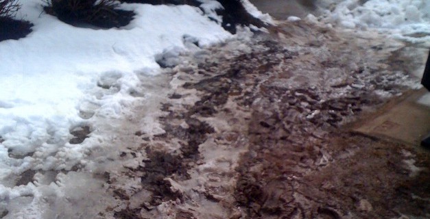
Clearly this is a path, one that people use a lot. A popular spot to enter the Superstore just off Barrington Street, we use it every time we go (aside form these super muddy situations).
Here’s the problem: poor user experience. Superstore should make a path, paved or gravel or something permanent.* And clear it in the winter when it snows.
So what’s this got to do with the Internet? Let’s look at user experience, or UX if you wanna sound cool.
When planning, it’s never going to be 100% clear exactly how people will use things. Usability geeks can offer best assumptions, and in the digital world we can do things like usability testing and in many cases make changes quite cost-effectively. Which leads us to the first lesson:
User experience design isn’t finished when the project is over. You can always learn from your users, read examples of new things, and just have ideas after the fact. Plus your competition is doing it, and new competitors are popping up and starting where you left off.
The pages and clicks people go through to get to what they’re looking for. You can see this in applications like Google Analytics for free. How are your visitors using your website or web app and is there anything in particular that needs a more direct path?
This is one of my favourite topics, a la Seth Godin. At Superstore it must not be anyone’s job. So then, at your company or website, who’s responsible? Not just for keeping up and doing the minimum, but improving by watching and listening and learning. Our advice is that it should be someone’s job.
*My only counter-argument is that it could be a safety thing since you’d generally use such a path to cut diagonally across the parking lot to get there faster, and declaring this a path may be like suggesting that’s ok. But it’s really no different than walking from a car, so a weak argument I think.
Great post, Ian. Daniel Burka talked quite a bit about this last year at the AIM Conference. He told a, likely apocryphal, story about a university in the states (MIT?) that left the whole area around the campus grass for the first year, to see where people would be walking, and then built in the paths.
He likened this to the way Digg’s UX has been designed — in pieces, in iterations, making sure that where the permanent paths are made suits the users’ needs.