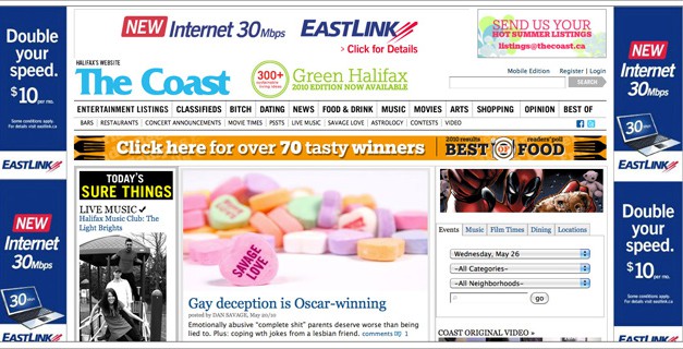
Recently Eastlink bought out The Coast’s homepage. People got paid to make this happen and it doesn’t look like much thought went into it. The ads are static as you scroll down, too.
Dear The Coast: C’mon, you’re the cool one. Like, the hippest publication in Halifax. Of course you need to make money. I know times are tough for print, but you appreciate creativity, right? Innovate, don’t settle in light of a big cheque, protect your brand.
And Eastlink, I’m sorry, but that is the worst ad ever, from design to messaging. (and how much does “mbps” mean to your average customer, or the average Coast reader? I guess a lot according to your research, right?)
Eastlink, you’re the fastest around, aren’t you? Your whole campaign is based on speed. And I think you’re right. So why not have a challenge, something like the Halifax Internet Speed Challenge (ok, spend a few minutes on the name), then pose it as a question, like you’re seeking an honest answer for everyone. That much more aligns itself with The Coast I think. Do some tests around and directly compare yourself to the competition (Aliant?). If your service is fast why not prove it? I think that’s entirely feasible for you to do. In the end, you come out on top, as the fastest provider in town, maybe with +1 PR even.
Or something. That’s just a thought, and the mechanics of how it’d work wouldn’t be so simple, but it’s the start of something that’s an attempt to make everyone look better. Oh and if your screen isn’t 1280px wide (most laptop screens) it’ll cover over the ads. Larger screen? How about another.
Genuinely appreciate the feedback on the ad.
Per recommendation in your post. EastLink consistently in the top 3 fastest networks in all of North America. See: http://bit.ly/dCerjJ
This totally objective rating is actually driven by our (and every other service providers) customers who do speed tests which automatically upload the results to this site and the results are publish continuously.
Your idea of a local speed test is cool. We feel this national/international ultimately objective rating is as good as it gets.
Thanks! I don’t think we’re the only ones who were a bit thrown back by this presentation. It’s good to see you in a position to actively listen to what people are saying and respond. While there’s no excuse for this to happen with two good businesses, no company’s perfect. Our hopes are to bring about positive change in the end, and be useful, which is why we felt it was important to not just criticize some ads but think of the “ok, so what could be done then?” :)
Yeah, it’s a really horrible looking ad that both the Coast and Eastlink should be ashamed of.
“oh, what’s this, The Coast has an ad on Eastlink’s website… but I typed in thecoast.ca…” ;)
ps. It looks like they’ve yanked the ads(?) – guess the public’s voice was heard
Yeah, they’ve been up for a few days prior so I don’t know if it’s a coincidence, but The Coast site looks better :)
you think the ad is bad have a look at eastlinks website.. my 10 year old could do better.. poorly laid out poor graphics and multiple dead links..
Oh I know…they should hire a cool local firm to awesomize it *coughnudgewink*