Update August, 26, 2010: Well as it turns out, the day after I posted this we got invited to a Basecamp project with another firm, and the note for the option to use an existing account is now to the right of the form instead of at the bottom. So, great!
 You may have already heard of a Web app called Basecamp by a company called 37signals. Why didn’t you tell us? It seems pretty popular…
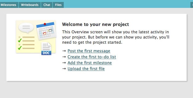
Anyway, its big feature is a lack of them. Some people complain about it, but they do pretty well. Basecamp is great for keeping your stuff organized internally (aside from whiteboards and a giant calendar), but it’s really designed for your clients. When you invite people (you can invite everyone you want on a project) they get a nice welcome email, sort of with the assumption it’s their first time using the service*. It’s designed to be easy to use from your very first time, it has to be. Just take a look at these shots that come up for each new project before you start adding things:
Your clients are happy, everything’s in one place, it helps you keep the ball rolling, and look pretty pro. Ever get 30 emails over a few days with bits and pieces of content? Writeboards. Seriously, that may be my favourite part.
*If it’s not, you can use your existing login info, it’s just really small under the signup form. Probably my only real complaint. Good thing I found it when I did, was running out of variations of my name.
Do you use Basceamp, or something else? What’s your take on it all?
I chose to use it for project management for group projects during university, it was simple and we didn’t need much more out of it. In my last year my professor at Dalhousie asked our class to use Zoho Projects instead (it’s got a couple more features and still free, but not as simple) so everyone was using the same thing – have you tried that one out?
I’ve never used Basecamp, but after reading ReWork, I can only assume the simplicity. These guys seem like they really value design, and simplicity.