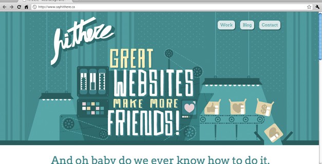
It’s that time of year (well, sort of). hi there recently celebrated its 2nd birthday in a state of quiet busyness. Each year since we started the company we’ve redesigned our own website – finding time for yourself can be tough but it’s something we think is pretty important to keep current. And you know, we sell them. This one is a big one. We removed yet another section (“Services”, before that it was “Approach”) and sort of melded that into the homepage and moved the contact info to the footer for easy access. And of course it’s a responsive design – try it on your phone, it looks super-sweet on a Retina display!
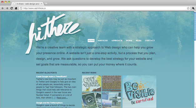
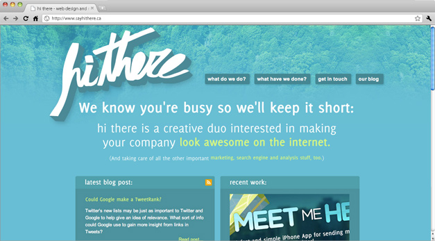
Here’s our first and second iterations:

hi there '09

hi there oh-ten
The portfolio got totally revamped to showcase our work in a fun new way to tell more of a story about the project and details that went into it. The blog became the Superblog! We jazzed it up with it’s own theme and images all around.
We’re pretty stoked and hope you are too. What’s you’re favourite new thing? We’d love to hear what you think – leave us a comment!
Looks great – love the new site!
You guys rock! So fun and interactive – I might have to call you.
My favorite is the revamp of the portfolio. Very well done, people like to see a story and what went into a project.
Love the portfolio, great to be able to read about the challenges and the results.