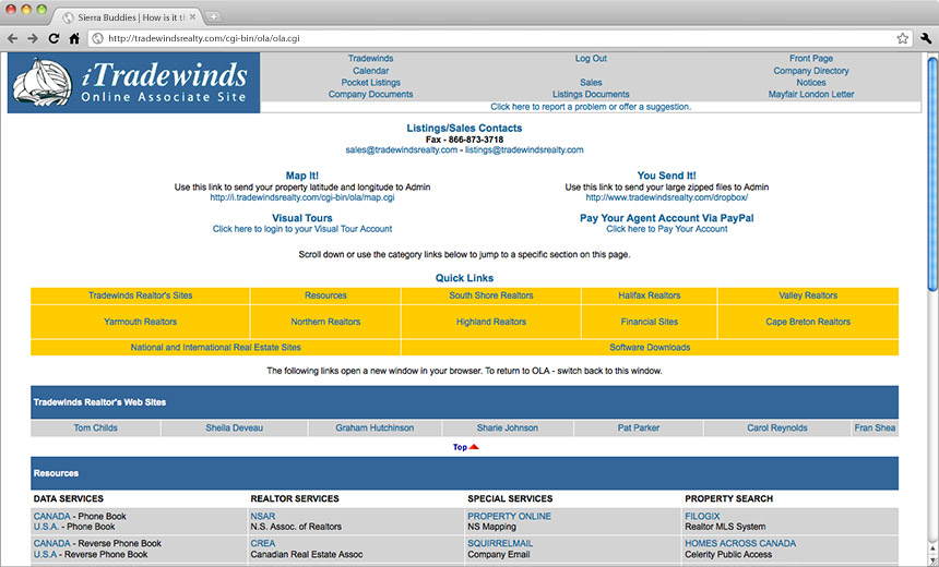
The old version. Served its purpose back in the day, but well past its prime. There were links to Google. Seriously.

We consulted with the client and sifted through Google Analytics to find what was most used and look for any other patterns, like unusually high time on site, that might indicate usability problems.

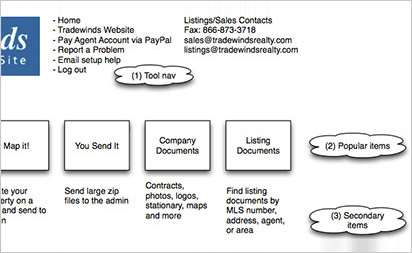
From that we drew out some functional wireframes to give the client a general idea of the layout and proposed new functionality, before moving into the graphic design phase.

The resulting idea was to call out the top features and bring them front and centre in a dashboard sort of style. The rest of the links were trimmed and organized into boxes that are hidden until you click to expanded, keeping the clutter to a minimum.

We redesigned and re-wrote the instructions for the mapping feature by shortening it to just the minimum and cleaning up the UI.
Another highly-used feature was the internal messaging. We simplified the layout and modernized the design and gave the content some breathing room to improve readability.
