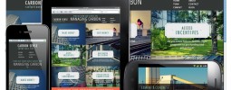
If you remember our first website (screenshot) there’s a pretty big difference. We really took a different direction on the messaging on the homepage, too. Our goal was to make everything more attractive, concise, and cleaner.
We wanted to keep the creative, and drop some of the serious to be more direct and let the site tell the rest of the story. You’ll also notice that we actually removed a page (“Approach”) and simplified. At the time we thought it was important to explain and to qualify the fact that we do research and a lot of other plotting and scheming before we produce things. We decided though, to mash this up with what we do and try to communicate the same thing by saying less.
Everything else got a shade or two more casual and a notch brighter, we feel this better reflects our brand. We also took another go at the contact page, and even got a fun new email address. Go have a look.


