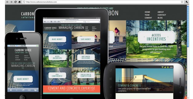
Displays keep getting bigger and better, but they also keep getting smaller and better. Over the last few years something interesting has happened, I think probably starting with the iPhone: Just when bigger was always better, people started to be perfectly happy with smaller screens. Crazy eh? Everyone wants mobile devices. They’re basically pocket computers. Now there’s devices like netbooks and MacBook Airs, iPads and Anrdoid tablets, smartphones and even iPods with web browsers that work surprisingly well. It’s really incredible. Both Nick and I went form a 15″ laptops to 13″ MacBook Pros; they’re nice and super portable (of course we have other displays to plug into for work). My friend Allan travels with nothing but an iPod touch to stay connected. As it’s turned out you can do a heck of a lot on a small screen if the interface is designed for it.
Enter responsive web design. Jeffry Zeldman wrote about responsive design over a year ago, and of course A List Apart was probably the first to have an article on responsive web design. The big deal is that, in most cases, you can design a site that will adapt to fit the screen no matter what device you’re on (tiny phone or giant TV) with a pretty reasonable increase to budget.
The great part about responsive design is that it’s all controlled by styles, so the HTML – your actual site – remains the same, all in one piece. This means you can run your favourite CMS or blog platform and have a WordPress responsive design where you’ll just be managing the same website while offering a better experience to non-standard devices (mainly Apple and Android – Windows Phone just started supporting this technology, and BlackBerry, well, sorry).
Sure they are. And they will be more and more. Web traffic on non-standard devices (desktops and laptops) is set to be under 50% by 2015. Again, crazy eh? Things have gotten more difficult for us web designers. Whether someone’s searching for info on your business while out and about (think restaurants, especially), doing researching on the go, or clicking links in emails or from their friends via social media, there’s lots of ways people can get to your site on a smartphone or other mobile device.
If you’re thinking about redesigning your website, or starting a new project, now’s the time to start thinking mobile websites.
Look at some of our latest responsive web design work and see how much nicer everything looks and feels. Yeah we’re totally plugging ourselves but hey, it’s nice work eh? Visitors are instantly engaged in the experience rather than clicking and zooming around or struggling to read small text.
“Mobile websites and responsive design: The Internet isn’t just on computers anymore on Superblog! by hi there Web Design & Marketing” in reality got myself simply hooked on your webpage! I actuallywill be back again even more regularly. Many thanks ,Saul